Diversity, Equity & Inclusion Network Guidelines
Our Diversity, Equity & Inclusion Networks (DE & I) reflect our commitment to a inclusive and equal working envrionment.
Read about the overarching principles of our DE & I Networks on our website here.
When communicating in an official capacity on behalf of a Network, please use the following guidelines to help keep the DE & I Network brand and messaging consistant and professional.
These guidelines should be read in conjunction with MCD’s Brand Guidelines and Built Environs Brand Guidelines.
Diversity, Equity & Inclusion Network logo
Our DE & I networks have an official logo. Representing all the DE & I Networks as a holistic group.
Use the below logo at least once when talking/reporting about DE & I Networks. Ideally on the front and/or back cover of the document.
|
For use on light backgrounds:
|
For use on dark backgrounds:
|
The DE & I logo can also be used in a lockup with the MCD and BE logos to better represent the relationship between the Networks and our brands.
|
For use on light backgrounds:
|
For use on dark backgrounds:
|
Hi-Vis Network
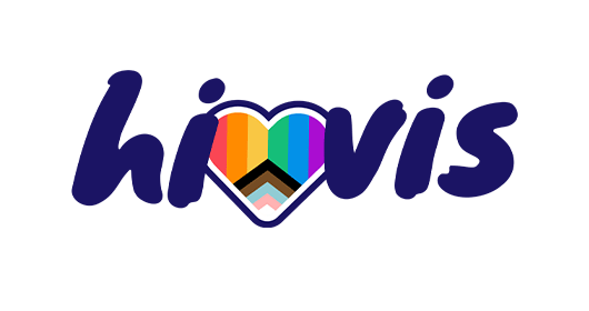
HiVis stands for Highlighting Inclusion and Visibility on Infrastructure Sites, the Hi-Vis network should be always be referenced using it's official logo:
|
HiVis logo:
|
Hivis logo with white outline:
|
Colours
The below sets of colours can be used as base colours for HiVis collateral and reporting.
Use the 'hero purple' is the primary colour and should be used on covers and front pages of reports.
|
Hero Purple RGB: 27/20/100 |

Rainbow Red
RGB: 250/70/84
HEX: #fa4654 CMYK: 0/87/61/0 |

Rainbow Orange
RGB: 255/139/0
HEX: #ff8b00 CMYK: 0/55/100/0 |
Rainbow Yellow
RGB: 249/199/68
HEX: #f9c744 CMYK: 2/22/84/0 |
Rainbow Green
RGB: 21/190/121
HEX: #15be79 CMYK: 74/0/72/0 |
Rainbow Blue
RGB: 3/145/232
HEX: #0391e8 CMYK: 75/35/0/0 |
Gender Equity Network
TBC
Examples of proper use
TBC

